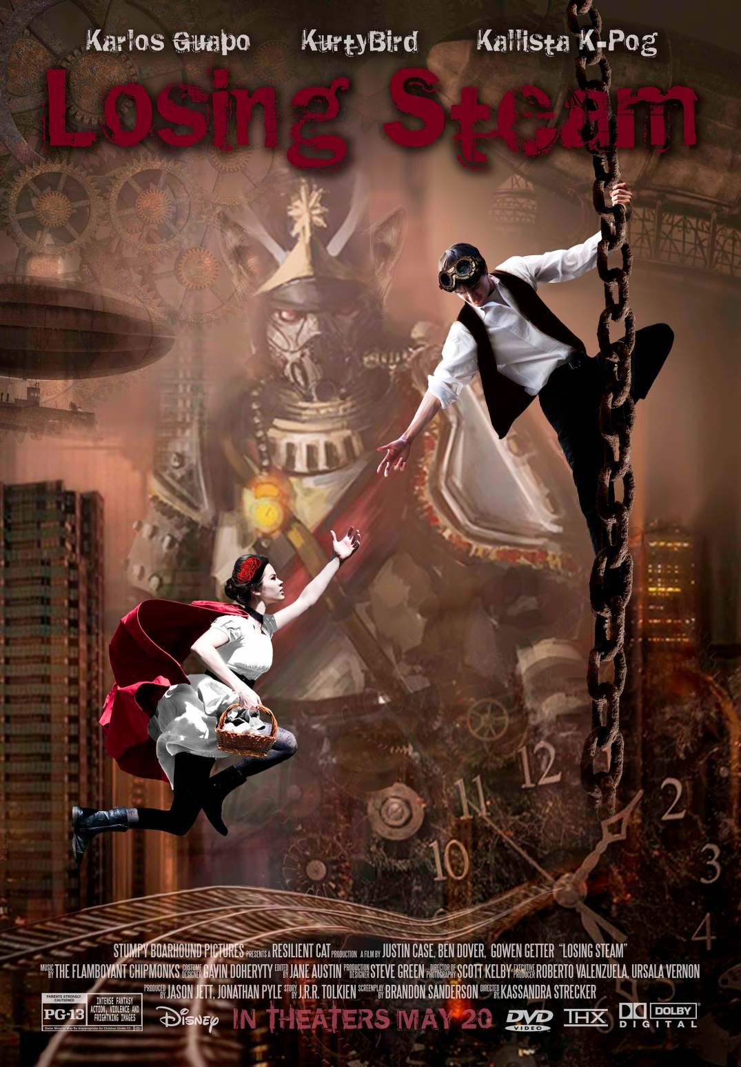
One of the most time consuming projects I’ve ever done was my Advanced Photoshop final project. My assignment was to create my own movie poster, complete with the movie name, credits and rating. The poster’s main purpose was to showcase my mastery of Photoshop and design principles. It’s been a while since I completed this poster but it is still one of my favorites! I’m attaching some of the different images here that were used in this project.
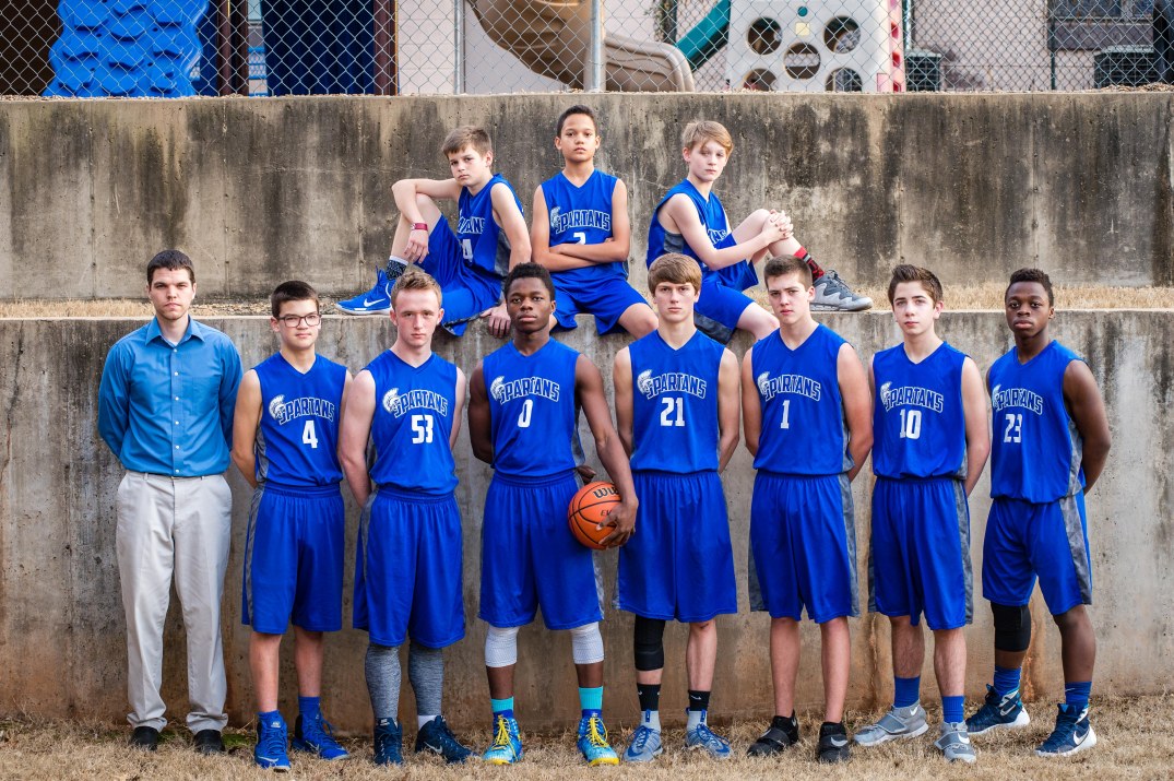
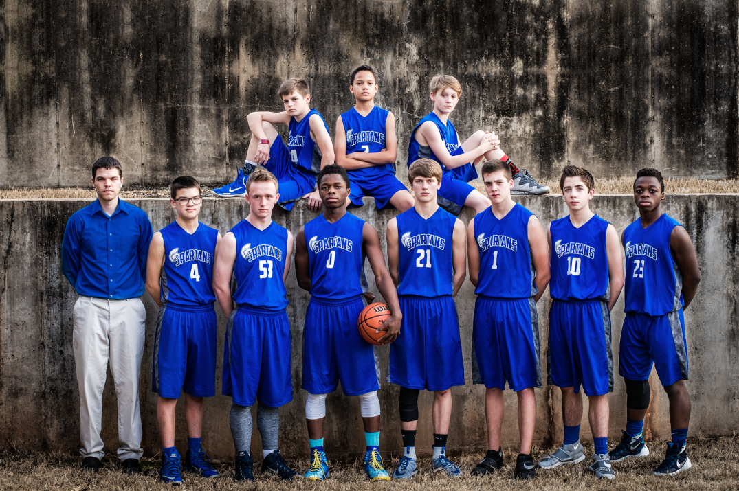
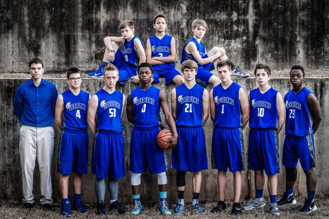
I was recently given the task of retouching some images for a high school basketball team – The Stillwater Spartans. My goal for these pictures was to achieve a dramatic look without the images looking fake and I’m very pleased with how they turned out. I’m going to walk you through what I did on one of the shots. If you want to see some of the other pictures I did of the team, you’ll find them in the Photo Retouching gallery.
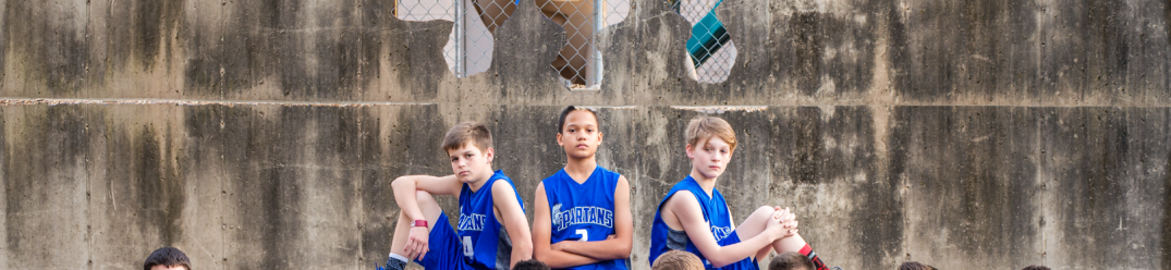
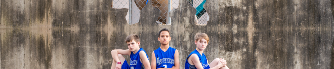
The picture I’m going to walk you through is of the 9th grade team. The original picture is a good picture. The team’s pose is well balanced and the background is cool. Unfortunately, the background they had to work with was a little bit too short, so that was my first course of action.
Spartans 9th Grade Team – Before
To fix the wall problem, I selected the visible part of the wall (avoiding the top of the player’s heads), copied, pasted then flipped the wall copy so that it was mirroring the lower part of the wall. As you can see in the following screenshot, I picked up a few things that I didn’t really want showing (like the top of the wall and some of the lighter hues that make that line a very defined edge).
I used a layer mask and a soft edged brush to fix that line and to create a smoother transition between the two sections of wall.
Next I selected my whole image, went up to the Edit menu and chose Copy Merged (which makes a copy of whatever is visible) then pasted to a new layer. This allowed me to then use the patch tool to recreate the missing sections of wall and get rid of some of the obvious mirrored elements.
After I finished the wall, I went on to fixing the coach’s shirt. I felt like his shirt ought to match the player’s uniforms and the blue of his shirt just wasn’t as bright as the player’s jerseys. Thankfully, this was a pretty easy adjustment to make. I simply selected his shirt and then added a Hue/Saturation adjustment layer (to which I upped the saturation and increased the hue slightly) and voila! I was pretty happy with the adjustments I’d made, so I saved the image and then took it into Lightroom for my final tweaks.
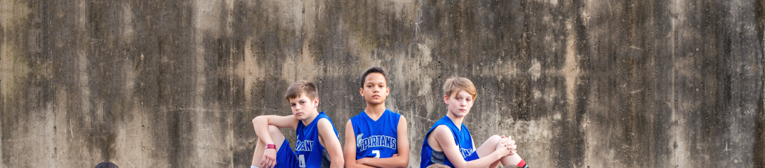
I liked the wall a lot, but I wanted to really bring out the awesome texture and give it a super “tough guy” look. Using the brush tool, I painted over the wall and then raised the clarity all the way up and dropped the saturation and exposure a little. This really took the wall up a notch in my opinion.
As I was working on the wall, I kept finding myself distracted by the red socks that the player sitting on the wall was wearing. I grabbed the handy dandy brush tool again and swiped it over the sock, desaturating it completely.
To finish it all off, I made a few final adjustments to the entire image. I dropped the saturation, increased the contrast and clarity, decreased the overall yellow hue and then cropped the picture in just a little bit. The final result was even better than I was expecting.
Spartans 9th Grade Team – BeforeSpartans 9th Grade Team – After
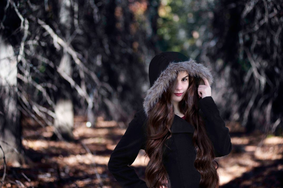
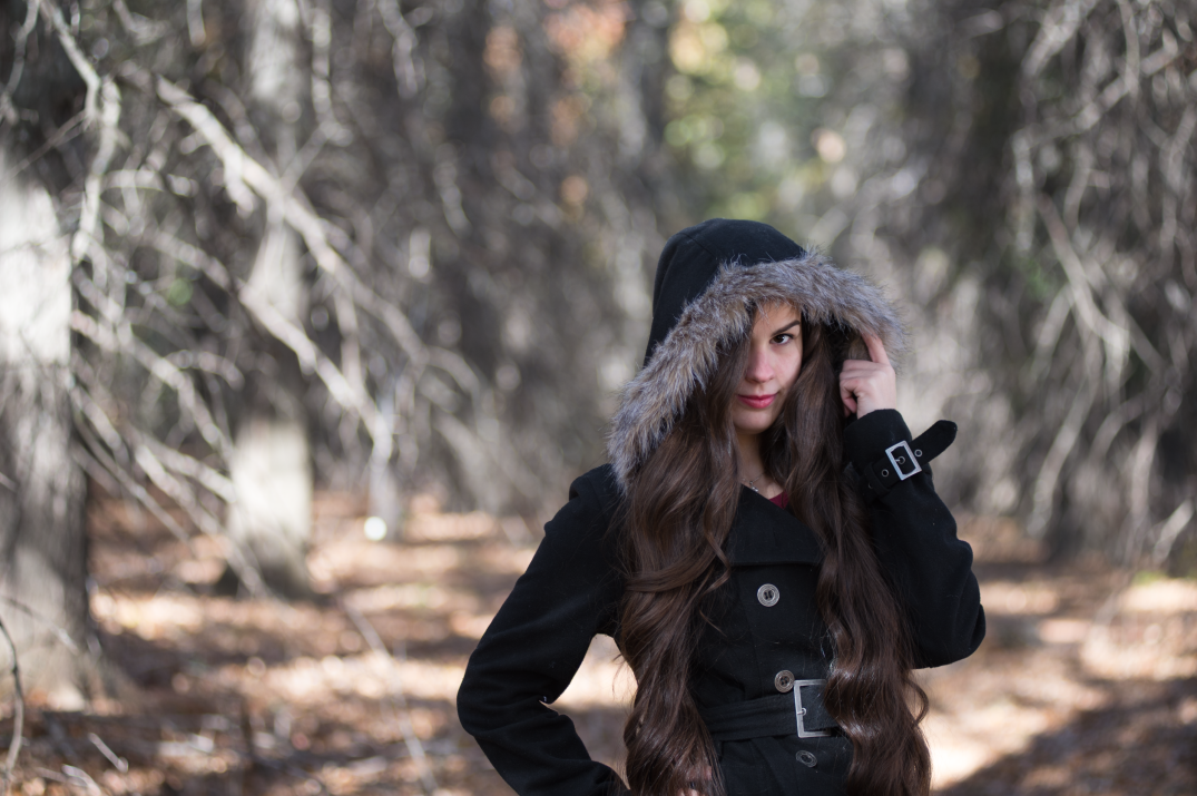
There are so many great things you can do in photoshop! One of my favorite photoshop jobs is enhancing photos to take an image to the next level. This picture had a lot of retouching potential.
One of the first things I wanted to do was even out the shadows and skin tone on my face and neck, as well as remove some of the stray hairs that had made their way across my face. When that was finished, I started retouching my jacket so as to make it slightly less distracting (and also because my original intent for this photo was to use it in a composite image where the buttons and buckle would not have worked with the look I was going for).
Next, I wanted to bring out my hair. I cleaned up a lot of the stray hairs and then I used the quick selection tool to make a base selection. After I modified my selection to get a crisp cut, I added levels and color balance adjustment layers that were clipped to my selection (this allowed me to make direct adjustments to my hair without having the entire image modified). I added a little bit of red to my hair and brought out some of the natural highlights.
As I was working on my hair, I noticed that there were some weird shadows on my neck and a bunch of distracting hairs (those things are everywhere!!!). Using the healing brush tool and a new layer (so as not to loose the original image in case recreating my skin didn’t work), I evened out the shadows on my neck and got rid of those stray hairs, resulting in an evened out tone and a softer look.
The last modification I wanted to make to the foreground (myself), was to lighten and smooth out my skin to make my features pop a little bit more.
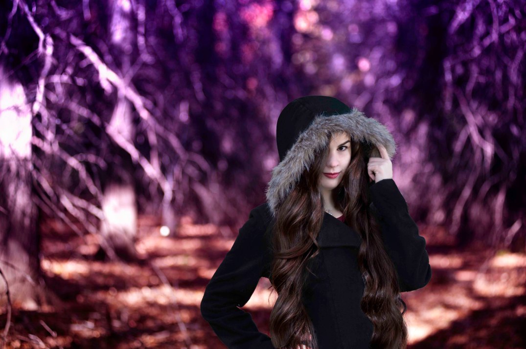
I had a lot of fun messing with the background. Upping the contrast helped make it pop, but I felt that it was still missing something, turns out that something was a boost in saturation. When I saw how well adding color worked, I decided to attempt a gradient overlay to see what that would look like. That gave it a whole different look (almost like a fairytale forest).


 One of the first things I wanted to do was even out the shadows and skin tone on my face and neck, as well as remove some of the stray hairs that had made their way across my face. When that was finished, I started retouching my jacket so as to make it slightly less distracting (and also because my original intent for this photo was to use it in a composite image where the buttons and buckle would not have worked with the look I was going for).